While researching all 180 players in our 2021 World Travel Insurance Benchmark For OTAs, the Ancileo team came up with key insights for the UI/UX of the purchase touchpoints of the embedded travel insurance.
These best practices can help OTAs ensure a higher conversion rate and convince users to buy travel insurance, thus boosting revenue from one of their key ancillary streams. UI/UX and a smooth user experience can sometimes really be the make or break point in the purchase decision of the user. Not only can it maximize revenue generation opportunities but also reduce troubleshooting and associated costs. A more finished and professional look of the website sets you apart from the competition too.
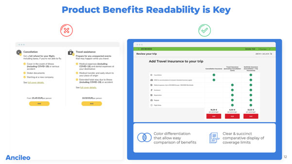
Simple and well-organised products benefits in a panel or tabular format that makes the pros and cons of all plans evident in one glance, encourages a more direct approach and saves the user a lot of frustration and time. Readable information organised in a digestible manner is quicker to read, easier to understand and easier to retain. Tools like colour differentiation which allow easy comparison of pros and cons as well as clear and succinct comparative display of coverage boundaries are all things which can essentially help you sell more travel insurance.
A high quality website can help empower OTAs to boost the conversion rate of travel insurance. Rarely would a well-known company or even a startup feel confident in promoting products when their website is poorly designed and doesn’t show any of the product benefits clearly.
Personalised lifestyle image displays along with demographics matching the customer’s needs and requirements will create a positive impression of the company and are likely to draw in more users to potentially buy travel insurance. Tags, such as ‘Recommended’ will help catch the user’s attention and spend more time studying the travel insurance plans and schemes. By displaying prices by per day instead of by full figure will encourage upsell.
Other marketing tactics can include callout bubbles to highlight the disadvantages of not buying travel insurance as well as live numbers of converting customers to create peer pressure, such as “15,389 customers have secured their trip in the last 3 days. What are you waiting for?”.
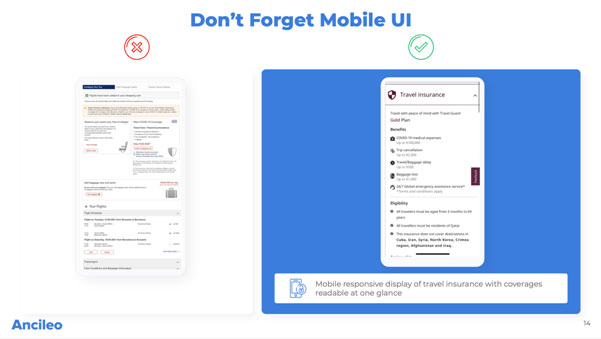
A website interface and mobile UI are starkly different but are based on the same principles of simplicity and functionality. The mobile responsive display of travel insurance too should be able to show the coverages and their benefits at a glance and without any unnecessary clicks or scrolling which hamper the user’s probability of purchasing the cover. The interface must only display the essentials by prioritising elements as screen space is limited in mobile UI. Further, it should be optimised for both portrait and landscape modes. While desktops allow for multi-column formats, which enable elements like a navigation menu, sidebars for widgets, etc, a single central column is best for mobile devices.
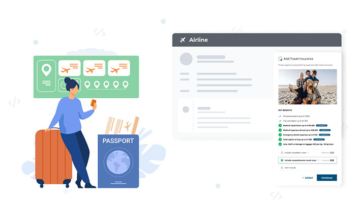
This is another way to smoothly integrate cover on the customer journey popular among many travel players. Product benefits displayed directly without the user having to make any additional clicks will increase ease of viewing the advantages of the product and the scope of coverage. Basic principles of human psychology dictate that this will induce more users to give more attention to this section rather than just scrolling past it. Not only will it increase travel insurance conversion rates but also website conversion rates.
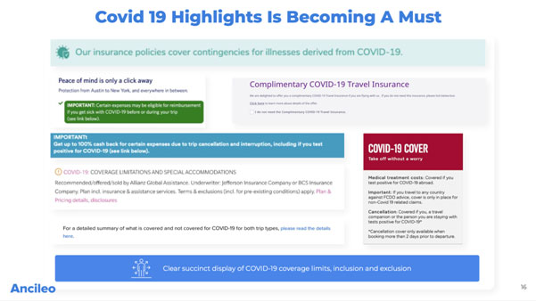
The pandemic is still foreign and daunting to travellers and OTAs must ease this by displaying COVID-19 protection, including its coverage limits, inclusions and exclusions clearly. The image below shows how various travel players have displayed their COVID-19 coverage plans through eye-catching display features like pop-ups, appealing graphics and words like ‘complimentary’.
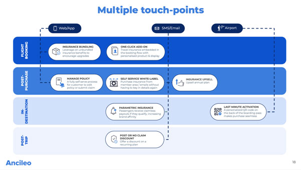
OTAs have improved their conversion rates by getting insurance products through to the customer at many different junctures to coerce the customer to secure their trip. The graph below shows the existence of multiple touchpoints such as during the flight booking, as discussed in this blog, post-purchase, in-destination and post-trip, through channels like web or app, SMS or email as well as at the airport.
The full research deck contains detailed information of the 180 OTAs:
This deck will enable OTA platforms to benchmark their competitors with ease. If you are from the OTA industry, contact us here to get access to the full research deck at no cost.