Unforeseen disruptions often leave travelers anxious as they search for solutions. However, for travel insurers and airlines, it’s an opportunity to showcase travel insurance in-path. This article dives deep into our “Top 50 Airlines Travel Insurance Benchmark 2024,” analyzing seven handpicked in-path insurance use cases.
We dissect their winning UI/UX strategies for in-path travel insurance, revealing how the leading airlines and travel insurers leverage clarity, user-friendliness, and engaging visuals to captivate travelers and drive sales. Additionally, we uncover insights and propose ideas to enhance the presentation of travel insurance offerings, with the goal of providing actionable suggestions to improve the overall in-path experience.
Let’s get right to them!
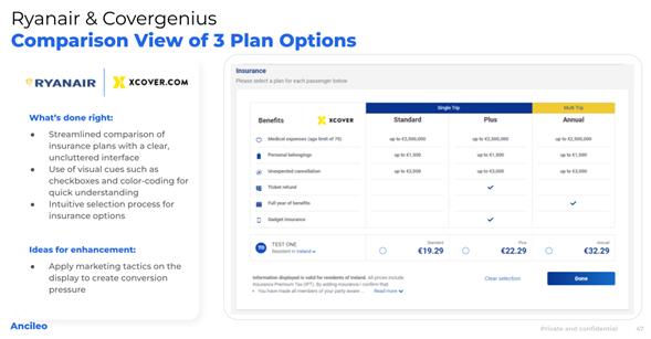
Ryanair and Covergenius understand that clarity is key. Their in-path insurance presentation shines with a clean and uncluttered interface. Three plan options are laid out side-by-side, allowing for effortless comparison. Checkboxes and color-coding intuitively guide users towards the plan that best suits their needs, while concise descriptions ensure travelers understand the coverage provided. This transparent and user-friendly approach empowers travelers to make informed decisions quickly and confidently.
While the interface excels in clarity, there’s always room for improvement. Incorporating conversion-driven marketing tactics could nudge travelers towards making a purchase. For instance, displaying limited-time discounts or highlighting customer testimonials could add an element of urgency and social proof, further incentivizing travelers to secure their travel plans.
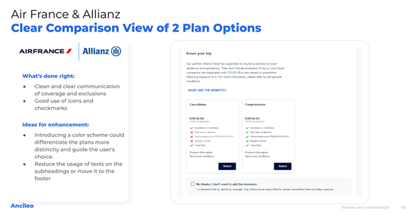
Air France and Allianz prioritize clear communication, ensuring travelers have a firm grasp of the insurance offerings. They effectively utilize icons and checkmarks to visually represent key benefits like trip cancellation, medical coverage, and baggage protection. This approach eliminates the need for deciphering lengthy text descriptions, making the information easily digestible and readily understandable. By focusing on visual clarity, Air France and Allianz empower travelers to make quick and informed decisions about their insurance needs.
Introducing a distinct color scheme for each plan could visually differentiate the options, guiding users towards the most suitable coverage based on their needs and budget. Additionally, minimizing text within subheadings or relocating it to the footer could create a cleaner and more visually appealing layout.
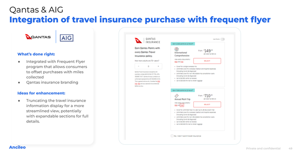
Qantas and AIG stand out by cleverly integrating their travel insurance with the frequent flyer program. This innovative approach allows travelers to leverage their collected miles to offset insurance costs, creating a valuable incentive for purchase. Travelers who have diligently accumulated miles are likely to appreciate the opportunity to put them to good use, potentially making them more receptive to purchasing insurance. Additionally, the use of Qantas insurance branding adds a touch of familiarity and trust, potentially reducing perceived risk and encouraging travelers to consider the insurance option more seriously.
The integration is undoubtedly innovative, but the information presentation can be further optimized. Streamlining the travel insurance information display could enhance the user experience. Consider using expandable sections for detailed information, keeping the initial view concise and visually appealing. This approach would allow travelers to access the specifics they need without feeling overwhelmed by text-heavy content.
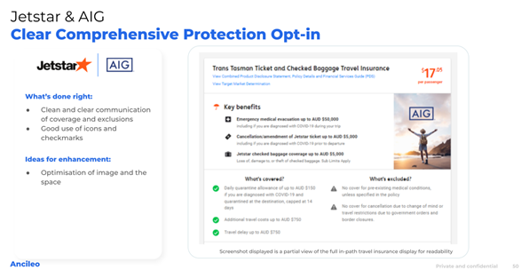
Similar to Air France and Allianz, Jetstar and AIG prioritize clear communication of coverage and exclusions. They effectively leverage icons and checkmarks to ensure key benefits are easily understood. This user-friendly approach empowers travelers to make informed decisions without getting bogged down in complex details. Additionally, they incorporate an image that depicts peace of mind and travel security, reinforcing the value proposition of the insurance product.
Optimizing the image and its placement within the layout could further improve user engagement. Ensure the image directly aligns with the insurance benefits or the travel destination it protects. For instance, showcasing an image of a relaxing beach scene could resonate with travelers seeking coverage for leisure trips, while an image of a bustling cityscape might be more relevant for business travelers.
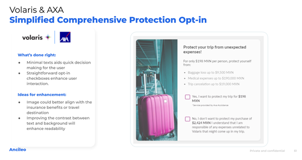
Volaris and AXA take a minimalist approach, utilizing straightforward opt-in checkboxes and minimal text. This reduces cognitive load and facilitates quick decision-making. Travelers seeking basic coverage can easily understand the offering and make a swift choice without being inundated with excessive information. This approach can be particularly effective for time-pressed travelers who prioritize convenience and efficiency.
While minimalism has its merits, there’s room for subtle improvements to cater to users with accessibility needs. Improving the contrast between text and background could enhance readability for individuals with visual impairments. This would ensure everyone has an equal opportunity to understand and make informed decisions about the insurance offering.
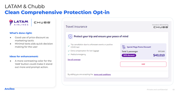
LATAM and Chubb understand the power of price incentives. They effectively attract user attention by displaying a prominent discount on their travel insurance. This discount acts as a persuasive call to action, encouraging travelers to seriously consider the insurance option. Additionally, they replicate the successful approach of other airlines by adopting a minimal text and clear layout design.
While the current approach leverages price effectively, “Add” button’s visual prominence could be further enhanced. Employing a more contrasting color could make it stand out more, grabbing even greater attention and potentially prompting user action. This subtle change could contribute to increased insurance sales without compromising the overall design aesthetic.
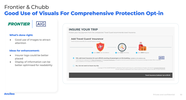
Frontier and Chubb recognize the power of visuals. They strategically leverage eye-catching images to grab user attention, making their in-path insurance offering visually appealing and instantly recognizable. This approach effectively breaks through the text-heavy nature of online booking processes and captures user interest, potentially prompting them to explore the insurance option further.
The insurer logo could be better positioned to improve brand recognition. And ensure a clear association with the insurance product. Also, optimizing the information display for readability could enhance user understanding. Consider using bullet points or infographics to present key benefits and coverage details clearly and concisely. This would allow travelers to grasp the value proposition quickly and efficiently.
The airlines featured in this article showcase a diverse range of innovative approaches to in-path travel insurance presentation. By prioritizing clear communication, user-friendly interfaces, and strategic marketing tactics, they are effectively guiding travelers toward making informed decisions and driving sales. As the industry continues to evolve, we can expect to see even more creative and user-centric approaches emerge, further solidifying the role of in-path travel insurance in the travel landscape.
These insights are an extract from our 2024 Top 50 Airlines Travel Insurance Benchmark report.
Meanwhile, you will interested in our past years release: