
Airlines recognize the immense potential of in-path travel insurance offerings, not just for revenue, but also as a powerful tool to build trust and enhance the overall travel experience. However, the mere presentation of insurance options falls short. Success hinges on a finely tuned user interface and user experience (UI/UX) that adeptly guides travelers toward well-informed decisions.
Our most recent study, the “Top 50 Airlines Travel Insurance Benchmark 2024,” unveils the optimal UI/UX strategies adopted by leading airlines in presenting in-path insurance offerings.
Let’s have a closer look at them.
Travel insurance often gets relegated to an afterthought, easily overlooked during the booking frenzy. A badly designed UI/UX only makes things worse, causing confusion, frustration, and missed opportunities for conversion. On the flip side, a well-crafted UI/UX can turn travel insurance from something easily ignored into an easily understood and valuable companion to the travel journey.
By understanding the psychology of travelers, who often seek reassurance and clarity amidst travel uncertainties, and applying strategic design principles, airlines and travel insurers can significantly boost conversion rates and build trust with travelers. This translates to a win-win situation: airlines gain satisfied customers and increased revenue, while insurers gain valuable market share and secure long-term partnerships.
Having explored why UI/UX matters in the presentation of travel insurance, let’s now examine three exemplary UI/UX strategies being implemented by the top airlines in 2024.
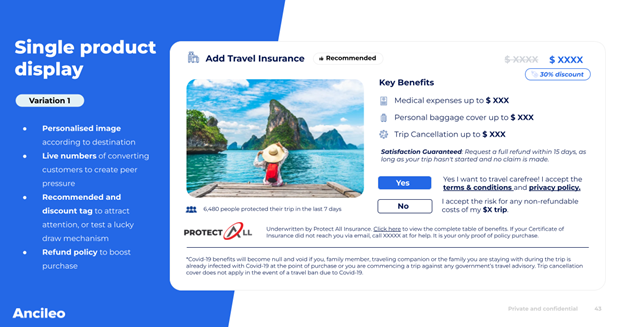
Many of the leading airlines use a single product display strategy for their in-path travel insurance offering. This strategy simplifies the decision-making process, focusing attention on a visually impactful image personalized to the user’s destination. Real-time conversion indicators add a dash of urgency, building credibility and trust. Additionally, elements like “Recommended” tags, discounts, and clear refund policies further enhance user confidence, ultimately prompting them to finalize the purchase.
The single product display isn’t just a visual gimmick; it’s a carefully crafted user interface. By integrating personalized visuals, real-time engagement metrics, and strategic tags, it fosters a seamless and confidence-boosting experience, transforming travel insurance into a positive addition to the booking process.
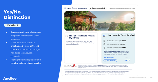
Offering a clear distinction between options with or without travel insurance is another key strategy. Visual cues, such as different colors and placement, guide users towards informed choices. This approach removes ambiguity, simplifies the user experience, and fosters decision-making clarity. Distinct colors and strategic placement on the right-hand side, for example, act as powerful navigational cues, drawing users’ attention to the highlighted option and enhancing the intuitiveness of the booking process.
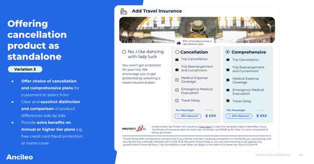
Recognizing the diverse needs of travelers, leading airlines offer cancellation-focused plans as standalone products. This strategy grants users the flexibility to choose between comprehensive or cancellation-only coverage. Clear and succinct comparisons between product features, presented side-by-side, empower users to make informed decisions. Additionally, highlighting extra benefits like free credit card fraud protection or home cover on higher-tier plans adds significant value and strengthens the appeal of these offerings.
From a UI perspective, clarity and simplicity reign supreme. Distinct and concise presentations of product differences ensure well-informed decisions. The visual organization and position of features contribute to a seamless and user-friendly experience, minimizing confusion and friction throughout the process.
The UI/UX strategies outlined above aren’t just for airlines, they are also your blueprint for presenting your insurance products more effectively. By incorporating these strategies into your travel insurance offerings, you can empower airlines to deliver a seamless and trust-building experience for their passengers, ultimately driving conversion and boosting your bottom line.
Here’s how to translate these strategies into actionable steps for travel insurance providers:
By embracing these actionable steps and collaborating with airlines. Travel insurers can transform the in-path insurance experience from a cumbersome add-on to a seamless and valuable companion. Remember, investing in a user-centric UI/UX for in-path travel insurance is not just about aesthetics—it’s about building trust, and empowering informed decisions. And ultimately creating a mutually beneficial outcome for travelers, airlines, and travel insurers.
The exploration of the three best UI/UX strategies for in-path travel insurance reveals a transformative approach adopted by leading airlines. These strategies not only counter the tendency to overlook travel insurance but actively convert it into valuable companion for travelers.
From single product displays to clarity in choices and flexible offerings, each strategy contributes to an enhanced user experience. As travel insurers consider actionable steps. The emphasis on collaboration with airlines and a user-centric approach underscores the importance of building trust and facilitating informed decisions. In essence, investing in strategic UI/UX is more than a design choice; it is a pathway to mutually beneficial outcomes. Promising enhanced experiences for all stakeholders involved.
These insights are an extract of our 2024 Top 50 Airlines Travel Insurance Benchmark report.
Meanwhile, you might be interested in our past years release: